Thursday, 14 December 2017

Final Outcome

After the last post, I went and created another shoot just trying to better the composition and I also took in a few more new acetate sheets with new textures and marks on them. I think the shoot went fairly well as I achieved the outcomes that I wanted. Below is a picture of my final outcome:


In order to shoot these outcomes, I got my subject to pull a neutral, more natural facial expression. This is because I wanted the photos to be subtle when compared to some of the staged, more expressive facial expressions in my first photos in the project.

My main influence for this piece was a butterfly. I find that most people would relate to a butterfly because everyone wants to be free. Especially at my age, 17, it is hard to live a free, no worry life due to pressures that school and jobs provide. I can relate to this as I find it hard to spend time with friends and family without worrying about anything. I used the colour blue as a colour palette as I thought that it had specific connotations of fragility and calmness which I think best relates to a butterfly. Meanwhile, I also used specific materials that I best thought would fit the idea of a butterfly;  cotton wool, cling film and bubble wrap. I used these as they are quite delicate and soft when compared to the newspaper and foil that I experimented with in my sketchbook.

I took inspiration from Agnus Cecile's work to her free marks as she is a very free to do what she wants in her work leading to expressive marks. Rather than using expressive mark making a lot, I was free with the type of materials I used and how I shot in the studio. Additionally, I took Flora Borsi's colour schemes into consideration and used the same colour throughout the triptych to show some common ground in the whole composition; this could also further imply how animals and humans are together as one and are similar to each other. I also took inspiration from Low due to some of the expressive marks that he uses, which is reinforced by the chaotic marks in the middle piece.

I was inspired by the research I did at the start of my project to create triptychs and the layout that is needed to create one. I think that the viewers will enjoy looking at my piece because of this layout.

Progress from first initial outcome to this:


My main inspiration for the first piece was the butterfly and this related well to Santana Borboletta's LP album cover. I was highly influenced by the blue butterfly in this piece and I think that this came through pretty well. However I wanted the audience to have to think about the piece a bit more and what I could have been trying to say, which is why I had made the decision to remove the butterfly in the hopes of the viewers coming to this conclusion.
Additionally, rather than editing the photo digitally and combining the marks with the photo through Photoshop, I decided that the outcome may be more subtle if I were to combine these in one photo. I think that this worked well and it is much more subtle than the first piece that I had created.
Also, I think that the low saturated colours in outcome 1 created a sinister vibe, which is something that I did not want, considering the animal I chose to represent was known to be free and delicate. This is why I decided to keep the saturation the same so that there is juxtaposition between the colder colours and warmer colours to find the perfect harmony.
I had not experimented with materials at that point when creating outcome one, which is why I have been able to refine and develop in outcome 2. The combination of materials works much better than without the materials as it leads to a more interesting textured piece.

Sunday, 10 December 2017

Mat Collishaw Research and Analysis


Mat Collishaw is an artist who strives to combine nature with a dark twist on life. In his “Insecticide” body of work, he shows nature destroyed and juxtaposes the idea of life and death in an imaginative way.


Mat Collishaw
“Insecticide 24”
2008
Photograph
182 x 182cm
His technique for this photo was to crush certain aspects of nature, in this case dead butterflies and layer and compose them in a way that gives depth and matches his deep thoughts about the matter of life and death. Although this is a print of his work, the layering of the wings and bodies of the butterflies increases the form and shows destruction of life in multiple ways.
The different textures and patterns adds contrast to the piece and helps show all the different forms of destruction of beauty in the world. The contrasting colours of the blue and yellow indicates the idea of juxtaposition and matches his concept all together. For instance, where yellow meets blue, where warm meets cold, where life meets death. I believe that the fact that he has placed his work onto a pitch-black background shows how all life is actually surrounded by darkness, however I am more focussed on life rather than death in my work, which is why I would use an opposing colour to black, such as white.
As far as composition can be discussed, I think that he centralised his work in the frame to present the idea of nature and life being the epicentre of death and destruction and how devastation will eventually consume all life and nature.
Towards the beginning of my personal investigation, I placed my hybrid animal photos onto texturized boards and I really think that I could create similar experiments with natural materials, like the board with the owl hybrid. This will link to my current work as I am focussing on a butterfly and human; I will be able to use my current experiments as inspiration to maybe create backgrounds that would suit the photos for my final outcome. 
Overall, I really like Collishaw’s work, in particular this piece, as he manages to portray nature in a unique way that hasn’t been shown before. However, he focuses on death more than life, whereas for me I would most likely want to illustrate life more than death. Due to the difficulty of finding and using dead insects for my work, I think that it may be useful to use other natural sources of materials. For example: leaves, grass, bark etc.

Thursday, 7 December 2017

Photography Shoot with marks and textures that I have been experimenting with.

I went into the photography studio to shoot for my final outcome and it went relatively successful however there are a couple of things that could be improved.
This photo was taken by lighting the background through the use of a blue gel and then shining a second light at the subject through the acetate sheet. 
The acetate sheet had marks on it that most reminded me of a butterfly and its nature; I used cotton wool as I thought that the soft texture best resembled the nature of a butterfly. I used clingfilm as I thought this best complimented the cotton wool. The colour blue was used in these marks as I think that blue is more of a delicate colour than red, for example. I also used PVA glue to set the materials onto the acetate in a way that that creates a contrast between textures; some of the cotton wool would be rough, whilst the rest would be soft. This worked quite well.
In the beginning, when shooting I did not particularly like how the subject's face has been blurred out, however after looking over the photos I really like it. I like how it creates depth and shows layering. This kind of distorts reality in a sense as layers are created. 
However, I think that I need to add more layers to the photos by placing multiple sheets of acetate in front of and behind the subject. This will engage the audience more as they will begin to question how the artwork was created.

Sunday, 26 November 2017

Plan for final outcome.

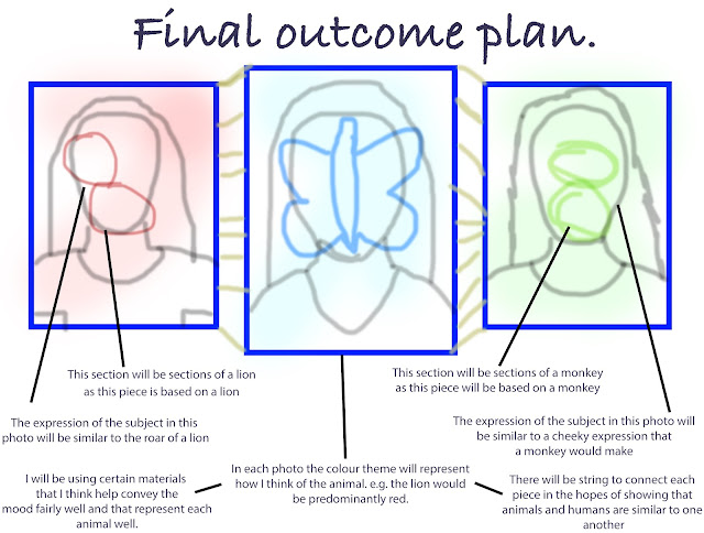
After having created sketchbook work for preparation for my final outcome, I have decided that I am going to be creating a triptych of framed photos that have been worked on top of to illustrate the idea of animals and humans being similar to one another.


Artist influence for the piece:

  • Vince Low - I am using influence from his work through the expressive line in the animal drawings that I am going to involve in my work; I loved his use of chaotic lines to create a highly expressive piece.
  • Agnus Cecile - After looking at Ceciles work, I was fascinated by her use of expressive marks and colour to convey a certain mood or emotion when thinking of the piece. I am going to use colours and marks that help express the nature of the animal successfully. For example, in the first composition, I am going to use red and harsh marks as I think it represents the ferocity of the lion fairly well.
  • Flora Borsi - As I have a similar concept to Borsi, I can relate to her work better than the others and I am using a similar layout in each composition as well as same colour schemes in each individual piece to show the common ground between animals and humans.
  • Andy Gotts - The inspiration that I got from his work was the use of unique facial expressions and this is what I will use to my advantage; my subject will have a similar facial expression to the animal that I am trying to show in each piece.


Equipment/materials that I will need:

  • Printed photos of subject with animal drawings on top (edited through photoshop)
  • String (to connect the pieces together)
  • 3 photo frames (A4)
  • Acrylic paint (Red, yellow, blue, white and black)
  • Ink (Red and Blue)
  • PVA glue
  • Paintbrushes
  • Bubblewrap (for texture)
  • Cotton wool (for texture)
  • Cling film (for texture)
  • Cardboard (for texture)
  • Fibreboard (for texture)
  • Coloured thread/string (yellow, green, orange - for texture)
  • Bright tissue paper (for texture)
Final Outcome plan change
After creating the butterfly piece, I began to think that I was becoming a bit too disrespectful of the photos, meaning I had to be more subtle. As I like working with photography, I am planning to create a series of photos in the studio that has the model positioned in the centre of the shot (for balance) and then placing some acetate sheets in front of the models face to slightly disrupt the photo. I will be placing the butterfly illustration on top of this.

Wednesday, 15 November 2017

Using sellotape transferral for my photos

Rather than using acetate to work on top of and behind my photos, I wanted to use the sellotape transferral method for them as I think that this shows more skill and it allows me to make certain areas of the piece translucent when compared to more opaque areas.

Step by step of process:
My first step was to place sellotape over the photo so that each strip is layered slightly over one another, however I had to try and get the sellotape as flat as possible so that there were as little air bubbles as possible.
After the previous step, I dampened the scouring side of the sponge with Luke warm water and then in a circular motion I started to scrub the paper off of the sellotape as this would leave the ink on the sellotape and then create an acetate like piece.
The step of scrubbing the paper away can be repeated with multiple sellotape photos in different ways, especially if you just wanted to only make some areas of the photo translucent. The translucent parts can be seen when held up at the light. 
I am going to use these sellotape transferrals so that I can create marks on top of and behind them to see which provides me with the best outcomes. If I end up wanting to go down the hand made piece route rather than the digital route then this will be the technique that I use.

UPDATE (21-11-17)
I have created a couple of experiments with the use of these sellotape transfers however, I don't like them as they block out too much of the marks that I want to show and the use of the sellotape leads to the photo becoming slightly dirty. I placed the photo over some marks yet I don't think this worked as well as it did when I was applying marks over the image itself rather than underneath it.

Past students work that I am inspired by:

After having talked to my teacher regarding my work, he pointed me towards a body of work that a previous student had created from their time in A Levels as he though that it would link well with my work. These are a couple of compositions from their body of work:
My favourite aspect of these pieces are the fact that the artist has managed to manipulate the photos in a unique way that contribute towards the overall piece and atmosphere. I really like the subtle marks that are added to the photo and how they can affect the mood of the piece. For instance I like the drips on the portrait of the boy as this makes me think of their emotions being drowned out and becoming a puddle of feelings instead. Also as the photo is quite dark, I think that they have been very creative and smart by using dark colours as this benefits the subtlety of the composition.
After looking at these pieces, I think that I need to work into the photos more in a way that I can use marks and colour to benefit the piece. I will start off by using a photo multiple times and creating a variety of different marks and tactile experiments on them to see what looks best with the photo itself.

Sunday, 12 November 2017

Experimenting with marks and materials

After having done my colour experiments with red and experimenting with the different types of marks that I could create to evoke mood and atmosphere, I went on to use these marks and combine them with different materials to increase and develop textures in my work. As the colours that I was using in these experiments are based on the colour red and the harmonious colours that go along with it, I think that when comparing the work to an animal, it would be one of a nature that is fierce and quite brutal. For instance, a lion. Some of the marks that were created on the materials were inspired by the work of Agnus Cecile due to her unique textures and marks that she is able to create with her mediums.

1 - When creating this experiment, I was able to show a gradual change in colour as it went from yellow to red to black as I used a sponge to delicately overlay each colour. I used a wood similar to chipboard as I though that this would give a rough texture and would link well to the mood and colours that I was using in the piece. I like the rough texture that is created when the paint hits the surface.
2 - I also like these marks that are created on this surface as they represent the fierceness that I wanted to show in the piece as I will most likely end up pairing these marks with a lion. I like how I have almost fragmented the composition by only applying the marks to the chipboard that I used and I think this would work well when placed onto a photo.

3 - I don't really like this use of cardboard with the marks as it creates certain patterned marks that I don't think work well when compared to the mood and atmosphere that the colours evoke. Additionally, I don't really like the marks that I have created as it appears more like block colour than actual expressive marks.
4 - On the other hand, I do like these marks as they are quite subtle and would work well on a photo as it won't distract the viewer too much from looking at the main focus of the piece, that will be the human and animal aspect of the composition.  I do think that these marks work well with the cardboard when compared to the chipboard as the marks come out smoother on the cardboard.
With both of these experiments, I believe that the marks will suit the ferocity of the animal I will choose, however I think that they overpower the materials used and therefore will definitely overpower the portrait and animal drawing that is created. I believe that the variety of colours in experiment no. 5 is much better than those in no. 6 due to the range of harmonious colours that go with red. However, I do also like the subtlety of the marks in no. 6 as the colours blend well together, even through the use of dry brush.
7 - Overall, I really like this experiment as I used the marks that I have previously liked working with. As the base layer, I used a sponge to gradually blend yellow into red and red into black; this also created a fairly rough texture. I then used the edges of a piece of cardboard to create the angular, linear marks in the wet paint. Whilst this was drying, I used the same technique on the chipboard and then broke it apart so that I could glue each fragment, like experiment 2, onto the first created marks. The marks on the chipboard came out a lot darker du etc the brown colour it originally had. This composition was made with the combination of the marks and layout from my favourite techniques from the previous experiments. I believe that this shows development. One thing that I wish I could have done to better this composition was make the blend between yellow and red more subtle.

COURSEWORK EVALUATION.

From the very beginning of my coursework, my main intention was to show the differences in animals and humans in my work, however I abando...