Artists
and their work:
 Cornelia Parker –
Parker is an artist who uses a whole room to exhibit her artwork to create the
impression of something exploding and being destroyed.
The
wood has been suspended from the ceiling in a spacious way to show the movement
of the materials as they move outwards from the focal point. The
light in the centre of it all casts shadows around the room presenting the idea
of the darkness slowly taking over. Rather
than the wood creating a natural feeling to the artwork, the way in which they
are shown gives the idea of something very abnormal happening. The
fact that the composition is in the centre of the room allows the viewers to
see the artwork better and walk around it so that they fully understand the
work.

Trafik Kör – Kör suspends his photography on the side of walls, yet each photo is pushed outwards from the wall as each photo is fixed onto different sized boxes.
The fact that he has pushed each photo out from the wall could show how each individual object in the photos are not your usual objects and that they are separated from normality. On the other hand, the regular shape of the cube gives that sense of normality and balances out the juxtaposition between the two differences. The fact that they are pushed out from the wall allows the viewer to believe that there is more to see behind each photo (gives depth to the composition).
My photos:
After
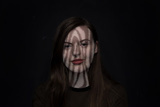
having edited these photos, I am happy with the outcome considering that it I
have only just started experimenting like this. Although that in the photos
where I have placed the animal’s print over the face, the outcomes are a little
strange, I like the effect that it has (I wanted to show that humans are
similar to animals). It creates a surreal impression, similar to that of Amy
Hamilton’s work and in the majority of the photos, I have used a black
background with a vignette, just like Andy Gotts. If I was going to transfer the layout of my pieces to that of an installation, I would suspend my work off of the ceiling or the wall as I think this would create depth in the composition. It would suggest that behind a human there is always layers and that each human has an animal inside of them, spiritually.
Here are some examples of the photos that I
created:


No comments:
Post a Comment