My aim for the first part of the summer holiday is to create multiple portraits and get comfortable working with dry materials, before I go on to work more in the style of my artists.
 |
1st drawing - portrait in HB pencil
Overall, I really like the outcome of the shape and scale of the portrait, which then enabled me to make out other certain facial features, such as the eyebrows. However, I started to struggle when it came to actually marking out the eyes and mouth, which is something that I wanted to improve on in the next drawing. I started to use the stippling effect in the beard area and that is a good technique to use when create a stubble like effect, yet the consequence of this is that it is time consuming. Finally, the places that are meant to have high contrast in tone should be refined in my next drawing. |
 |
2nd drawing - portrait in HB pencil
In this drawing, I think that I have managed to create an accurate shape and scale however in some areas like the hair could be refined and improved by using a much softer pencil (such as a 6b) to create darker tones when compared to the lighter tones; this would therefore help to improve form as well. The useful parts of a pencil is that when sharpened you can get fine lines which creates the illusion of hair strands. In my next drawing, I decided to move onto a different medium that I may be more comfortable with.
3rd drawing - self portrait in charcoal
To create this drawing, I have started to use charcoal to create a more realistic portrait which I think has worked more successfully than the pencil portraits. I have shaved he charcoal to get charcoal dust and I have applied the medium using a paintbrush. Shape and scale is fairly accurate however, I found it difficult to draw finer details with the size brush that I was using so I will therefore change brush types in the next drawing to suit the facial feature. On the other hand, I am happy with the contrast in tone that I have created as this is key to creating a good form; the hair and areas of the jumper are evidence of this. |
 |
4th drawing - portrait in charcoal
In order to create this drawing I used the same technique as before with the paintbrush and the charcoal dust. I really like the contrast in tone with this drawing as in the darkest places, I have applied the charcoal directly, whilst using the dust and paintbrush to create the lighter tones. One aspect that I don't like with this drawing is the fact that it is slightly unsymmetrical, unlike the original photo so to improve on this next time, I am going to spend more time on sketching the shape out accurately. I placed the strip of metallic material over the eyes as I think that this allows the viewer to relate more to the picture as they could see themselves in the portrait.
5th drawing - portrait in charcoal
For this drawing I used an older subject to see if I could create good tone and textures in the places that have more wrinkles (in this case, around the mouth). I used a picture I took when shooting in the style of Andy Gotts, as shown by the quirky facial expression pulled. I have created a fairly good differentiation in tone as it builds up form and makes the drawing look slightly real and 3D. I am really happy with the shading in some areas such as the contour on face and the hair. Moreover I am really pleased with the shape and scale as I spent more time planning where certain features were going to go. |
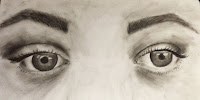 |
6th drawing - eyes in charcoal
I created a larger drawing of eyes due to the fact that I am having difficulty drawing sets of eyes on small scales so overall I am happy with the outcome. I used the charcoal dust to create those tones that are lighter than places such as the eyelashes, pupils and eyebrows, as it also has a smoother texture than just applying the charcoal immediately. I believe that I have created shape and scale accurately. To create the texture in the eyebrows, I used the brush technique and then use a sharp part of the charcoal to create finer hairs. To improve the drawing, I would try and add tone to the area between the eyes to improve form. |
 |
7th drawing - portrait in charcoal
I am fairly happy with the outcome of this piece due to the fact that I have created high contrast in tone by layering the charcoal dust multiple times in the darkest areas and then only applying one layer of charcoal dust in the lighter areas. Once again I have used a strip of metallic material as a I like the idea of covering the eyes as I think this will allow the viewers to see themselves as the person. However if I was to improve the drawing, I would try to create a smoother texture on the skin as it appears quite blotchy in some areas such as the forehead. |
 |
8th drawing - portrait in charcoal
From looking back at this portrait, I am mostly happy with the contrast in tone in tone as it creates a more realistic form as some places appear 3D. Another aspect of this drawing that I am happy with is the texture of the hair and t-shirt as I used the stick of charcoal directly to create finer hairs and the pattern on the shirt. Additionally I am happy with the shape and scale of the outline. On the other hand, I wish that I would have spent more time on the mouth area as it is slightly inaccurate regarding the shape.
9th drawing - portrait in charcoal
The contrast in tone in this drawing was created by layering the charcoal dust in the darker areas when compared to the lighter areas, however I directly applied charcoal to the top that the subject is wearing as it was completely black. I managed to capture the areas in the hair where there were layers by using darker tones and specific direction of marks to show the overlapping of hair. The shape is accurate and the scale of most aspects are accurate, however I think that I could have spent more time on texture as once again some areas seem slightly blotchy. |
 |
10th drawing - dog portrait in charcoal
I believe that I have captured the shape and scale of the dog very accurately. However a difficulty that I came across was the fact that the dog was white and therefore blended into the page easily, which meant that the shape was wrong, which is why I used the stick of charcoal directly to create an atmosphere that would capture shape successfully. The contrast in tone is high which means that the form is also quite strong. The hardest part to creating this drawing was the fact that the mouth was mostly all black with only small highlights, however I think I captured this factor fairly well. |


No comments:
Post a Comment